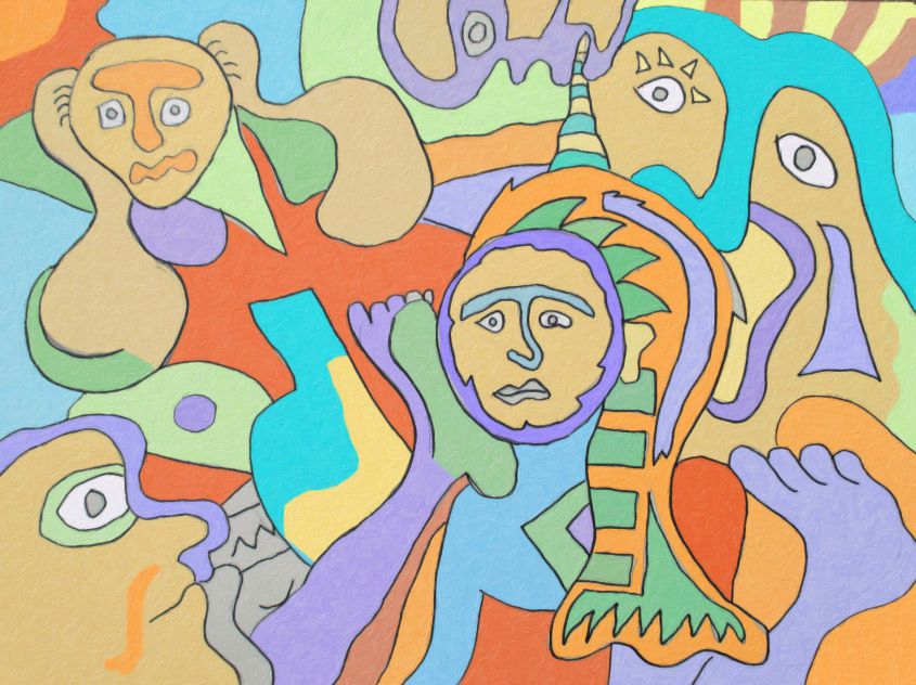
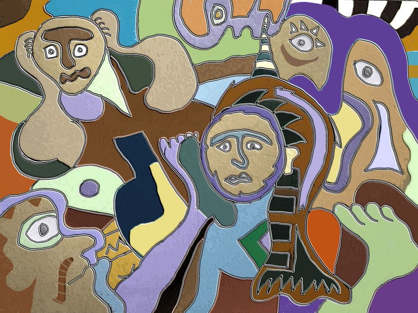
I did this drawing like 2 weeks ago. Just got around to colorizing it.
and I have 2 versions that I like of it.
let me know which one you like
If you dont like either of them then just say
THEY BOTH SUCK!!! LOL
I did this drawing like 2 weeks ago. Just got around to colorizing it.
and I have 2 versions that I like of it.
let me know which one you like
If you dont like either of them then just say
THEY BOTH SUCK!!! LOL
Please log in to report posts
35 comments
I like the bottom one… the feels.
Hope you’re not feeling this way right now 🙂
Thanks for your input.
Yeah I am divided.
I think the top one is more cheery looking
but the bottom one is more bad-ass. It has like stone effects and leather effects and I think I like the bottom one better. LOL
thanks
I like them both, but especially the bottom one because it’s making me want chocolate.
Yes. Or steak.
You chocolate hunter you. LOL
Yeah the bottom one has like colors that are like leather or chocolate and also colors that are like stone and or sand. I think I like the bottom one better myself.
I like them both. Can I do a color version of them? I’m in the mood to paint but not realism.
yes you can do a colorized version of them. that would be cool.
enjoy!!!!
yes, colorize them
being the remarkable art critic that i am i’ll give it a shot!!! literally!! as i raise my brandy glass to my lips full of vodka!
I like the 2nd one! i like earth tones, and the darker colors, seem to ascent the drawing a bit more and give it 3d look. hick-up! 🙂
cool rocket man > I agree with you and raise my glass of beer and say cheers.
LOL
I LIKE YOUR STYLE TOO! 🙂
They both are nice…. that said I like the top one quite a bit better…. actually I can say I really am not a fan of the bottom one (but I can recognize that it is in fact quite pleasant, just not in my taste) The black in the bottom one sort of does a really good job of pulling ones eye to it, and it highlights what I assume is the intended focal point (the guy with the main in the middle, as I get that same feeling from the top one too) and the black being in the two other places it is, sort of creates a bit of a movement thing as it draws (at least mine) an eye too them…. Which really is good, I just personally don’t like art that does things like this as I really don’t like the feeling of my eye being forcibly dragged across the piece :/
Thanks for your comments Shatterediris. Yeah I think the TOP one is more straight forward and more cheery > but the bottom one is more eye pulling and spatially arranged.
you have a good analysis of them both. Your right the bottom one is designed to pull your eyes here and there and well some people like yourself might not like that > but it was the desired efftect.
Kuddos. Enjoy the top one. LOL
shatterediris, OH For the love of Pete! do we have to start a reality TV show now! “The art critic’s” disagree with each other and make millions? hum? i like that idea!! 🙂
the drunken critic vrs. the whatever this thing is critic? O.o
hick-up! i resemble that comment! 🙂
I’m eating a banana creme pie right now -_- I hate it
Watching “Castle in the Sky” wish I was eating pie as well, but eating carrots instead. Fucking healthy diet.
damn it hazy, now I want carrot cake 🙁
Why did i just get a vision of you with buck teeth saying what’s up doc? 🙂
well my teeth are a little but buck…. so you aren’t wrong.
Rocketman: i like the colors there so colorful HICK-UP!
shatterediris: YEA! He’s a maroon ah real Rembrandt! chomp! chomp!
Whyyyy I auuut taaaaa…
yeah rocketman I would probably disagree with everything you say…. -_- that would add drama 😀
Sort of a psychedelic 15 year old’s interpretation of aliens inseminating primates. (My interpretation).
dude in the middle definately looks like he is being “inseminated”.
That’s totally what I meant.
The four outsiders have googly eyes, and they seem a little too interested about the monkey in the middle who looks a little worried.
HE DOES HAVE A WORRIED LOOK ON HIS FACE!!!! 🙂
I am worried that you are all going bat shit crazy!! LOL
GOING??? HA HA!!! WE ARE!!!! 🙂
Another thing I noticed is that in the bottom one, the center black shapes seem to resemble warped surreal shapes of an eighth note and a piano keyboard.
Abstract, of course.
The black keys aren’t in groups of three and two like they’d be on a real piano, but still, for me the “suggestion” is there.
So maybe that’s another reason why I prefer the bottom one.
OH yeah you’re right. Chocolate and keyboards. What isn’t there to like right?
Thank you Cordless. You have a lot of insight into things like this.
Cool Cordless. I like the way you read into my art. Yes I do see the indication of musical notes and musical keyboard. I think that is pretty neat. Yeah, I think the TOP One in more cheerfully colored. But I like the bottom one better because it has more texture to it. I think the bottom one has more character to it. Yes, some of it looks like leather or maybe chocolate… and some of it looks like stone and some of it looks like other textures
cool beans thanks for your comments.
These are great. I love abstract art because that’s how I am. Distant, made out I’m many different ways. Keep up the great work.