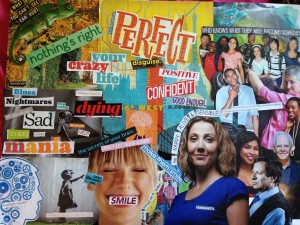
I just finished this college for my English 102 research project, tell me what you think! The people on the right represent society, and they are saying people should be “happy, alive, and sensible.” The girl smiling on the bottom represents a mentally ill person. She is smiling to try and conform to society and make people believe she is okay, but to the left you can see what is really going on in her head. Different words represent different mental disorders, for example I used “mania” for bipolar, “sad” for depressed, “worry” for anxiety, and “stop eating” for an eating disorder. The chameleon in the top left hand corner is watching “society” to see what they want, and it will readily change to fit in, much like a chameleon changes colors to fit their environment (I think?). In the middle are words such as “perfect,” “confident,” “good enough,” and “positive” to show the part of the mentally ill girl that she shares with the world and wants everyone to think she is. The point of my research was to show that social stigma hinders recovery rates and this is one of the visuals I chose to make to support that.
Report Post
Please log in to report posts

7 comments
I think its okay but without your explanation the meaning of the picture would be lost on some people….like these are just some suggestions but maybe you could put some different color chameleons with the words that represent the expectations of society on them to show how the girl changes herself to conform….and maybe for the mentally ill girl you could like find a picture of a brain and draw a face on it with a thermometer in its mouth to indicate the mental illness…..and maybe on the right you could post a few stereotypes and stigmas about depression that people have about it…..but I like the poster though…its nice
I like it.
ok! The idea is very good,but i don’t like the picture.here is what you should do.
Fix the background;this will make the scene more pleasant and story telling.
The girl is the leading role of the scene,so she should come front with out any obstacles(layers) in front of her.and she should be bigger than any character in the scene.and to make her even bold the other characters should be blured.
In order to distinguish between her situation and what she is try to pretend to be, their must be some kind of art that has to be emerged from her head.and making the blur value different for both of them(the real situation,and the “pretending” situations) can help.
The other main problem in your scene is,your characters doesn’t have interconnection between them.and this makes the scene soul less.so instead of getting a picture some where,you should capture your own picture.making each of your characters interconnectable.but if you still doesn’t want to do this things,you can fix the above picture with photoshop by taking the above tips.well this is it.
Wow I like your suggestions! I will incorporate some of those, thanks guys!
I like your collage.
But I don’t get you logic.
To me, it is a logic created by the pharmaceutical industry to sell more drugs.
If labeling people who display certain behaviors as suffering from various “disorders”, and then feeding them drugs to make them “normal” isn’t stigmatising people, then I don’t know what is.
What society needs IMO is a broader definition of “normal”. We need to accept that people are soft things that sometimes hurt and sometimes are crazy, and sometimes have a lot of trouble with basic stuff.
We need to create jobs for everybody, not just for people who cope well with stress and are left-brained.
Psychiatrists and the pharmaceuticals are deliberately pushing this agenda of “ending the stigma” of psychiatric disorders, and they’re doing it for their own sake, not yours.
So please don’t help them spread their lies: Their medicines make you chronically ill, and give you all sorts of other problems on top.
I think it is well done and says a lot.
The saying “a picture is worth 1000 words”.
I really dig it! I think it is a great expression.
Quick related story: I usually do one collage like this every year around Yule (New Year’s). I don’t think too hard, I just go with it and interpret it later. Now in tarot cards, there is a card called The Tower, which represents ruination and some SERIOUS, REALLY bad shit. I’d rather see the Devil, Death and the Hanged Man all together than the Tower. Anyhow, one year I made a collage, finished it, and stood back and read it left to right. With no planning whatsoever, it read
“What if I am stronger than the Tower?”
No joke.
Please hold on to your artwork if you can. I have a feeling it will have even more meaning and tell even more of a story to you as time goes on.